Fancybox is a JQUERY plug-in for photo slideshows that is used by millions of websites. It runs on JQUERY, which is a variation on Javascript. This means you must include a link to the JQUERY code library in the head of your .html page. W3Schools has the link here.
Go to the FancyBox folder, go to the dist folder, open the following files, and save them to your project folder:
jquery.fancybox.css
jquery.fancybox.js
Add the CSS inside your <head></head> tags: <link rel="stylesheet" type="text/css" href="jquery.fancybox.css">
Add a link to the main Javascript Library at Google in the head: <script src=”http://ajax.googleapis.com/ajax/libs/jquery/1.9.1/jquery.min.js“></script>
Add a link to the fancybox javascript. It must come AFTER the link to the JQuery library <script src="jquery.fancybox.js"></script>
Add the following to the HTML. Note that you need TWO images for each image: The thumbnail (smaller size) image that displays on the page, and the full-size image that displays in the fancy box. <div id = "gallery"> <p>Gallery </p> <a href="images/photo1.jpg" data-fancybox="images" data-caption="caption 1"> <img src="images/thumb1.jpg" /></a> <a href="images/photo2.jpg" data-fancybox="images" data-caption="caption 2"> <img src="images/thumb2.jpg" /></a> <a href="images/photo3.jpg" data-fancybox="images" data-caption="caption 3"> <img src="images/thumb3.jpg" /></a> <a href="images/photo4.jpg" data-fancybox="images" data-caption="caption 4"> <img src="images/thumb4.jpg" /></a> </div >
HTML5 video uses the <video> tag, and links the video file directly to the .html without going through a service like YouTube or Vimeo. Generally speaking, you should only use HTML5 video for short bursts of video, like video loops. That’s because videos longer than a few seconds can generate large file sizes that might not load easily on browsers, particularly mobile phones. If you have a non-looping video, you are almost always better off uploading that video to YouTube or Vimeo because those services can automatically adjust the format and the bandwidth to play on most devices.
If you have a short loop, however, HTML5 is your best option. YouTube does not do a good job of looping video – at the end of each video it comes to a full stop, which is not ideal for a loop.
Use Basic HTML5 Video for Video Loops
This is a basic video tag setup:
<video loop muted autoplay controls>
  <source src="movie.mp4" type="video/mp4" />
  <source src="movie.webm" type="video/webm" />
  Your browser does not support the video tag.
</video>
HTML5 Video Attributes Many of the video tag attributes are set in the .html file, inside the video tag, NOT the .css. Here are some of the more useful attributes.
loop – Tells the browser to automatically loop the video
<video loop>
muted – Mutes the audio from the video
<video loop muted>
autoplay – Automatically plays the video when the page loads. NOTE: Autoplay only functions in Chrome and Safari when MUTED is included.
<video loop muted autoplay>
controls – Shows the default video controls (play, pause, etc)
<video loop muted autoplay controls>
poster – Provides an image to show before the video loads, or if there is a problem loading the video. A .png file is the preferred format.
Multiple Video Formats for HTML5 Video .mp4 does not work on all browsers. In order for your HTML5 videos to work on all browsers, you should convert each video to .mp4 and to .webm. NOTE: Google Chrome in particular seems to have problems with .mp4. Here are some tools that let you convert your video to .webm:
Once you have your video in both an .mp4 and a .webm format, you insert it into the html like this:
<video autoplay="autoplay" loop muted>
  <source src="movie.mp4" type="video/mp4" />
  <source src="movie.webm" type="video/webm" />
  Your browser does not support the video tag.
</video>
Setting the Size of the HTML5 Video You set the width of the video in the .css. It’s best to use a percentage.
EMBEDDING HORIZONTAL AND VERTICAL VIDEOS FROM. YOUTUBE
Most of the time, except for video loops, you will upload your video file to a service like YouTube or Vimeo and then embed them in your .html file. To embed horizontal videos, use embedresponsively.com. To embed vertical videos you will modify the embed tag from. YouTube.
Embedding Horizontal Videos from Embed Responsively
Embed Responsively is a great utility that generates code for content from Youtube and Vimeo, Google Maps, SoundCloud, Twitter and other services in a way that will make them behave responsively in your site, which is what you want. You should use Embed Responsively when you want to embed these formats into your .html.
To embed a horizontal YouTube Video:
Go to YouTube
Select a video
Click on the SHARE button below the video
Click COPY to just copy the link to the video. (You don’t want to use embed here.)
Scroll down to see your video and some code below.
Notice that the embed code has two parts. The first part, which I have highlighted, is the styling that goes into your .css (not your .html). You want to copy all of the text between the style tags. You do not want the style tags. You want to begin with .embed-container and end with }. Paste this into the .css. This will add two classes: .embed-container and .embed-container object, .embed-container embed.
The second part begins with <div> and ends with </div>. Put this code into your .html where you want the video to appear.
Embedding Vertical Videos
Embedding vertical videos is almost as easy as embedding horizontal videos. First, you want to upload your vertical video to YouTube. It will come out horizontally on YouTube, with black bars on either side. However, you can change that within the .html.
Upload your vertical video to YouTube.
When it is done uploading, click on the SHARE button.
This time, select the EMBED option, and copy the EMBED code.
Next, paste the code into your .html
If you preview, you will see that your video is horizontal. You want to make it vertical. To do this, look at the code in the HTML. There should be a width and a height. Generally speaking, the width is 560 and the height is 315. Simply transpose this so that the height i 560 and the width is 315.
If you want the text to wrap around the vertical video, add iframe to your .css and set it to float: left or float: right, whichever you prefer.
We have been using getElementById to change the .html page with Javascript. For now, this is a good way to go because IDs have only ONE instance on any page. You can read about it here. The syntax is here:
getElementById(“nameofID”)
To change the text of an ID, we use innerHTML, like this:
getElementById(“nameofID”).innerHTML = “new text which may contain <p>HTML tags</p>”;
You may also swap out images in the html by assigning an img tag an ID. Remember – we did this in the cointoss example, which is in Canvas. Then you can use getElementById to swap out the src:
beforebegin is a position element that says: Place the stuff in quotes (“<p>Hello World!</p>”) BEFORE anything else that is currently in the ID. There are four positioning elements for insertAdjacentHTML:
beforebegin
afterbegin
beforeend
afterend
You can also use getElementById to swap out css instructions. This changes the background color of ID #nameofID to red:
CSS animations are usually based on transforms – changing the size, location, rotation, skew or other properties of an object on the page.
Transforms include:
matrix(n,n,n,n,n,n)
Defines a 2D transformation, using a matrix of six values: matrix(scaleX(),skewY(),skewX(),scaleY(),translateX(),translateY())
translate(x,y)
Defines a 2D translation, moving the element along the X- and the Y-axis
translateX(n)
Defines a 2D translation, moving the element along the X-axis
translateY(n)
Defines a 2D translation, moving the element along the Y-axis
scale(x,y)
Defines a 2D scale transformation, changing the elements width and height
scaleX(n)
Defines a 2D scale transformation, changing the element’s width
scaleY(n)
Defines a 2D scale transformation, changing the element’s height
rotate(angle)
Defines a 2D rotation, the angle is specified in the parameter
skew(x-angle,y-angle)
Defines a 2D skew transformation along the X- and the Y-axis
skewX(angle)
Defines a 2D skew transformation along the X-axis
skewY(angle)
Defines a 2D skew transformation along the Y-axis
But simply setting a css property to scale or translate does not result in motion. It modifies the appearance of the object on the screen. To introduce motion, you must use CSS Animation, and to use CSS Animation, you must define your animation using @keyframes in your .css file:
@keyframes myAnimation {
from { transform: translateX: -50%; }
to { transform: translateX: 0; } }
The above animation definition moves an object from off the page (-50%) to its starting position (as determined by the non-animated .html).
To use this animation, we have to apply it to a tag, a class or an ID in the .css:
Responsive design describes the process of producing content that transitions seamlessly from screen to screen – from desktop to laptop to tablet to mobile phone. Although it is a relatively simple concept, it is not so easy to implement in practice. Responsive Design enables designed publications that are not fixed, but always in flux. Web publishing has been slowly evolving in this direction. Web 1,0 (circa 1992-2003) was characterized by fixed page designs based on our assumptions of print publications such as books, brochures and movies. Responsive design breaks apart the idea of “pages” all together in favor of “modules,” or chunks of content that can be defined and quickly assembled or reassembled on different pages and devices. Media queries sniff out the screen size and resolution of a device before displaying content. Responsive designers create different design schemes depending on the device. Click here for a big gallery of sites using media queries.
Creating Responsive Layouts
There are two approaches to creating responsive layouts. First, you can use proportional measurements for fonts, widths and images; Second, you can use media query breakpoints.
The key to proportional measurements is to avoid using absolute measurements like pixels, points, picas, inches, millimeters and centimeters, and instead use percentages and ems. You can also use max-height, max-width, min-height and min-width with responsive design.
Percentages are used for properties like width, height, padding and margin. They reference a percentage of the containing element. So, for example, within a header style, padding: 1%; will set the padding to 1% of the size of the header.
Percentages are also used to specify a scalable size for images used in responsive design. Images are a little trickier, but will scale to the size of their containers. If your target device is a smartphone, it is a good idea to use a slightly larger image because some smartphones have higher-resolution screens.
One em is the size of the default text size on your device. Generally speaking, this is 16pt. You can use ems to specify font sizes. 1em is the default text size; 2em is twice the default size. You may also use values like 1.5em. If you use ems, set font-size: 100%; in the body style.
Most Web sites use single-column text layouts. If you want to use multiple columns of text, you need to use the FLOAT property.An example is here.
Breakpoint styles allow you to assign different styles to the same .html page, based on screen size and/or resolution. For simplicity, most designers use three breakpoints – screens larger than . You can use the breakpoints to point to three different stylesheets, or use @media queries in one .css file to separate the three different styles.
HERE'S AN EXAMPLE OF THREE DIFFERENT STYLE SHEETS:
<link rel="stylesheet" href="weather.css">
<link rel="stylesheet" media="(max-width:600px)" href="weather-2-small.css">
<link rel="stylesheet" media="(min-width:601px)" href="weather-2-large.css">
HERE'S AN EXAMPLE OF @MEDIA WITHIN A SINGLE STYLE SHEET:
@media only screen and (max-width: 499px) {
div {
width: 95%;
padding: 40px;
background-color: #F00;
font-size: 3em;
}
}

@media only screen and (min-width: 500px) and (max-width: 768px) {
div {
width: 95%;
padding: 40px;
background-color: #0F0;
font-size: 2em;
}
}

@media only screen and (min-width: 769px) {
div {
width: 95%;
padding: 40px;
background-color: #00F;
color: #FFF;
font-size: 1em;
}
}
You can also use a browser sniff technique that redirects the user to a different page when the user accesses your site with a laptop versus a smartphone. This requires you to build more than one site for your content. Here is an example of a JavaScript you can use to make the switch (put the script in the < head > tag):
There are some good pre-created mobile templates available now from the Web. They are not all responsive, but they take advantage of the mobile user interface. They all incorporate HTML5, CSS3 and Javascript/JQuery.
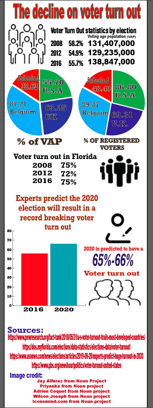
The United States of America is commonly known to have a very low voter turnout that has been declining throughout the years since the 1980s. The infographic below demonstrates and compares other countries’ voter turnout to american voter turnout.
In the United States, rate in voter registration is high with 86.8% of citizens being registered to vote, but participation in voting in elections is a different case. The average voting age population used to be as high as the 70% rate but now the average rate of VAP (Voting age population) is 55%. Experts predict that the 2020 presidential election will result in the highest voter turn out with in years with a highest prediction of a 66% VAP.
It is reported that many citizens don’t believe that their vote will make a difference so they just don’t participate in the voting process. It is reported that 4 in 10 people eligible to vote do not vote and they consist of poor and young people, as well as people who don’t think they are educated enough on the candidates to cast a vote.
This infographic highlights the racial differences between the presidential elections of 2012 and 2016. In 2012, President Barack Obama ran for reelection against republican candidate, Mitt Romney. After a historical campaign, running as the first African American candidate in 2008, Barack Obama was highly favored amongst the population, especially minority groups. In 2016, Hillary Clinton set another historical campaign against running mate, Donald Trump, being the first female to run for office. She seemed to be the favorable candidate amongst minority groups.
Seeing as both of these campaigns were starkly different from each other, and any other elections in previous history, I hypothesized that there might have been some major differences between voter turnout across these two elections. The United States Census Bureau takes a sample population and records this data of voter turnout, organized by race and gender. The sample population size did not differ much between 2012 and 2016, with 2016 leading by 5,984 in the sample size.
My theory was disproved when the Census data showed that voter turnout was higher in 2016. The voter turnout was higher in 2016 for three out of the four race categories being Asian, Hispanic/Latinx, and White. The Black population only missed the trend by being short 693 voters in 2016.
The messaging of Democratic candidates usually relates more to minority groups. Democrats are more seen as advocates for minority groups and their advancement. On the other hand, Republicans tend to be favored by the White population, and the wealthy upper class.
In 2012, Barack Obama ran with the campaign slogan, “Forward.” His campaigns were positively charged and encouraging. He encouraged citizens to come out and vote. Also seeing as he was a black candidate, that was a big motivator for citizens to cast their vote. In 2016, the presidential race held a very different tone, one full of more fear per se. Donald Trump was the elected candidate for the Republican party which instilled fear into those who did not favor him. I suspect that this fear was a motivator for citizens to vote, which caused a slight spike in voter turnout in 2016, going against my original theory.
As we all know, voting in state and national elections are vital to our future as citizens. So when it comes to showing up at the election polls, only a few states take their voting and participation seriously. According to the U.S Census Bureau data, it has determined the top states that have the highest voter turnout and the states with the lowest turnout. It’s very clear that the States with the lowest participation are not trusting either the Democratic or Republican party. Some individuals may have not registered to vote, or they don’t like any of the candidates, or they don’t care for politics at all. When millions of non-participant are not utilizing their voting rights, it can harm an entire nation for the lack of care. Thus, we all suffer as a nation, well at least most of us do.
This infographic depicts the top 5 states with the highest voter turnout and the top 5 with the lowest turnout. According to the data Maine, Wisconsin, Colorado, New Hampshire, and Minnesota have the most participation, with Maine taking the lead at 71.3%.
When it comes down to who has the lowest of them all, Hawaii, Texas, Virginia, New Mexico, and Tennessee takes the cake, with Hawaii being the number 1 state with the absolute lowest with 42.3 %. Voting is a top priority in the states and it should be every adults concern to make it to the polls to place their ballots. As of 2016 the most people went out to vote for someone whom they believed but has not quite done good by the people.
So due to our circumstances with President Trump being our Chief, I hope that the states with the lowest participation, will make it a priority to go to the polls to make their voices be heard and that they will be apart of the 2020 elections. For our lives depend on who we place in office; whether it’s local, national, or state, who we put our trust in, we hope that they will be for the people and do right by us all.
We should all act as though our lives depend on it, because it does. Future generations that come after us are depending on us. So it is imperative that we are intentional, present, and aware of what the future holds for us. We shall rise above it all by us voting.


 Web Design & Interactive Media